
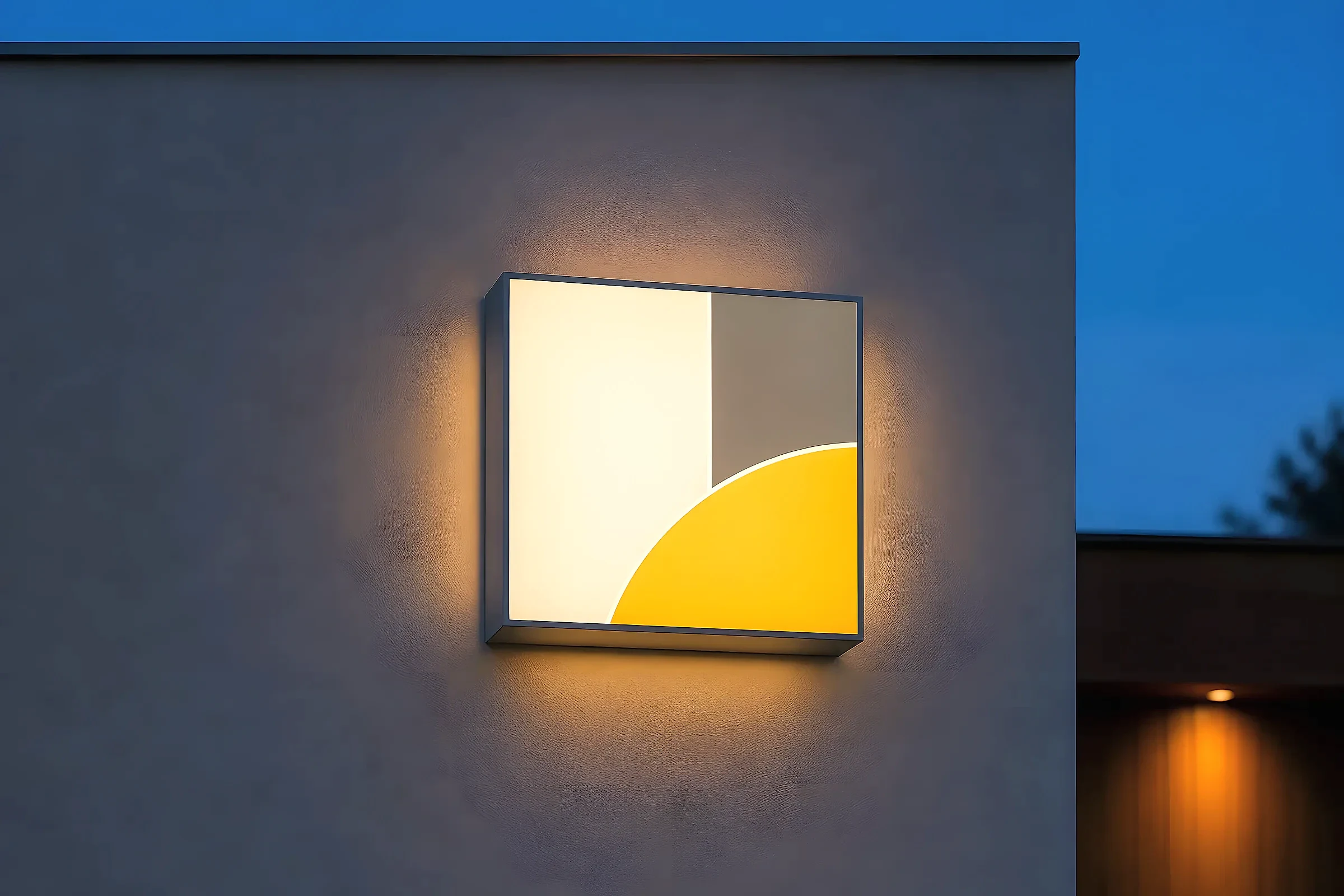
Light begins with the letter construction
An illuminated sign is not simply a flat panel with a lamp behind it. The way the face, sides and back of each letter are built determines where the light can escape. That decision changes the appearance of the sign during the day as well as after dark.
Most dimensional letters have a face, a side wall often called the return, and some form of back or mounting tray. Internal light sources sit inside that assembly. Opaque parts contain the light; translucent or open parts release it. The visible effect therefore comes from the relationship between the light source, the letter shell and the wall behind it.
Viewing distance matters too. A subtle glow can feel refined at the entrance to a building yet lose definition across a wide road. A bright face can carry further, although it may feel too direct in a quiet interior. The right construction starts with the intended viewing conditions rather than with brightness alone.
Face-lit letters
Face-lit letters release light through the front surface. Their faces are usually translucent while their returns and backs are opaque. After dark, the letter shape itself becomes the brightest element, so the word or symbol tends to read clearly from a distance.
The colour of the face influences both the daytime and night-time appearance. A coloured face can look solid in daylight and luminous after dark, but the exact shade may shift when light passes through it. A white face gives a clean, direct light; applied colour can create a more specific effect. Even illumination is important because visible bright spots can make a large face look patchy.
This method suits situations where immediate recognition is the priority. It creates a clear silhouette and does not rely heavily on the colour or texture of the mounting wall. The face remains the main visual surface in both lighting conditions.
Halo-lit letters
Halo-lit, or reverse-lit, letters have an opaque face and allow light to leave from the back. The light strikes the wall and forms a soft outline around each letter. The letter remains a solid object while the surrounding glow separates it from the surface.
The wall is part of the optical system. A smooth, pale and fairly matte surface usually reflects a cleaner halo than dark brick, deep texture or reflective cladding. The distance between the letter and the wall also affects the result. A shallow stand-off can produce a tighter edge; more separation allows the light to spread further and soften.
Halo lighting often reads as quieter than a luminous face because the viewer sees reflected rather than direct light. It can give dimensional lettering a strong daytime presence while adding atmosphere after dark. Its success depends on controlling the gap, the mounting detail and the reflective quality of the background.
Edge-lit forms
Edge lighting sends light through the edge of a clear or translucent material, commonly acrylic. The light travels within the panel and becomes visible where the surface is engraved, printed, frosted or cut. Instead of illuminating an entire letter face, it can pick out fine lines and outlines.
This construction is useful for slim signs, suspended panels and detailed graphics where a deep letter return would feel too heavy. The effect can be crisp and technical, especially when the lit edge is allowed to remain visible. It is usually more sensitive to ambient light than a bright face-lit sign, so contrast and placement deserve careful consideration.
The material must be designed as a light guide. Polished edges, engraved areas and the position of the light source all influence how evenly the panel reads. A clear sheet with a lamp beside it will not automatically create a controlled edge-lit result.
Choosing the effect, not just the fitting
The useful comparison is how each method behaves in context. Face lighting makes the graphic itself luminous. Halo lighting keeps the face solid and uses the wall as a reflector. Edge lighting uses the material to carry light into selected details. Combinations are possible, but every added light path also adds construction and mounting decisions.
Daylight appearance, viewing angle, background material and nearby ambient lighting should be considered alongside the night-time effect. A sample viewed against the intended wall can reveal more than a brightness specification because it shows the real contrast, colour and spread.
Viking Signrite lists illuminated signs under Signage.